The Anthropologie website to me is in many ways a very conventional site. It is
interesting to me how the conventions of creating a website have developed over time, which actually has not been that much time, and now there are do’s and don’ts to creating a good website. In the beginning of website design the main idea for creating a website was to make it as easy to use as possible. With the development of this idea there have now become certain norms of website design that people try to adhere to. The websites that stray away do so in ways that hopefully do not make the site less user friendly.
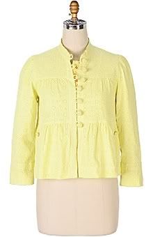
The Anthropologie website in many ways is a very conventional site. It has most of its menu icons functioning as drop-down buttons, which previously I was unaware to be one fundamental website convention. All of the buttons in the menu also look similar which allows the user to know without clicking that they all function with the same purpose. At the top of the home page there is a row of menu icons, which lead the reader to other information about the product. On the bottom of the home page it gives a row of similar looking boxes but only a bit smaller which are all menu buttons for contacting the company. One convention that the Dibbern website says is a commonality is underlining the words in the menu buttons. The Anthropologie website does not follow this convention but in my opinion I do not think that it makes it less user friendly.
Every website as well as every piece of writing has a focal point. To me if the focal point is hard to find or is not clearly evident, it makes the writing or the website much less organized and focused. The focal point on the Anthropologie website is the product. This makes a lot of sense, as this is the reason for the site, to sell the product. Even more so than the overall product, right now it appears to me that the focal point is more focused on new things for the season. We are coming into spring and the home page displays new apparel for spring. Also, the menu button that is a different color than the others is the one with the title, “new for the season”. The site is trying to draw the reader’s attention in this direction.
To me the website is very conventional and user friendly. For someone not so computer savvy, it makes the site much more appealing. It is in many ways very simple, each page does not display more than one or two items, which to me is beneficial because it does not overwhelm the user.
interesting to me how the conventions of creating a website have developed over time, which actually has not been that much time, and now there are do’s and don’ts to creating a good website. In the beginning of website design the main idea for creating a website was to make it as easy to use as possible. With the development of this idea there have now become certain norms of website design that people try to adhere to. The websites that stray away do so in ways that hopefully do not make the site less user friendly.
The Anthropologie website in many ways is a very conventional site. It has most of its menu icons functioning as drop-down buttons, which previously I was unaware to be one fundamental website convention. All of the buttons in the menu also look similar which allows the user to know without clicking that they all function with the same purpose. At the top of the home page there is a row of menu icons, which lead the reader to other information about the product. On the bottom of the home page it gives a row of similar looking boxes but only a bit smaller which are all menu buttons for contacting the company. One convention that the Dibbern website says is a commonality is underlining the words in the menu buttons. The Anthropologie website does not follow this convention but in my opinion I do not think that it makes it less user friendly.
Every website as well as every piece of writing has a focal point. To me if the focal point is hard to find or is not clearly evident, it makes the writing or the website much less organized and focused. The focal point on the Anthropologie website is the product. This makes a lot of sense, as this is the reason for the site, to sell the product. Even more so than the overall product, right now it appears to me that the focal point is more focused on new things for the season. We are coming into spring and the home page displays new apparel for spring. Also, the menu button that is a different color than the others is the one with the title, “new for the season”. The site is trying to draw the reader’s attention in this direction.
To me the website is very conventional and user friendly. For someone not so computer savvy, it makes the site much more appealing. It is in many ways very simple, each page does not display more than one or two items, which to me is beneficial because it does not overwhelm the user.